Difference between revisions of "Component: Starburst Display (Segment)"
| Line 5: | Line 5: | ||
|- | |- | ||
| width="20%" style="color:gray;" | Version | | width="20%" style="color:gray;" | Version | ||
| − | | | + | | 6.0 |
|- | |- | ||
| width="20%" style="color:gray;" | Category | | width="20%" style="color:gray;" | Category | ||
| Line 15: | Line 15: | ||
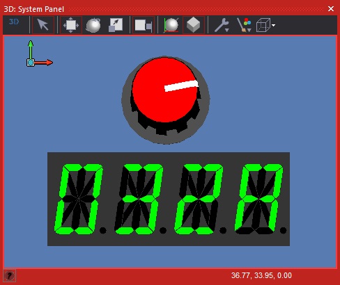
Starburst 14 or 16 segment display modelled after a standard 14mm high unit. LED colour can be changed in properties. | Starburst 14 or 16 segment display modelled after a standard 14mm high unit. LED colour can be changed in properties. | ||
| − | == | + | ==Version information== |
| − | + | Library Version, Component Version, Date, Author, Info | |
| − | + | 6, 6.0, 14-10-24, MW, Reduced Complex component as out of bounds | |
| − | + | 6, 6.0, 14-10-24, MW, Changed the look to reflect a real component | |
==Detailed description== | ==Detailed description== | ||
| Line 282: | Line 282: | ||
|- | |- | ||
| width="10%" align="center" style="background-color:#EAE1EA;" | [[File:Fc9-conn-icon.png]] | | width="10%" align="center" style="background-color:#EAE1EA;" | [[File:Fc9-conn-icon.png]] | ||
| − | | width="90%" style="background-color:#EAE1EA; color:#4B008D;" | | + | | width="90%" style="background-color:#EAE1EA; color:#4B008D;" | Colours |
|- | |- | ||
|- | |- | ||
| width="10%" align="center" | [[File:Fc9-type-1-icon.png]] | | width="10%" align="center" | [[File:Fc9-type-1-icon.png]] | ||
| − | | width="90%" | LED | + | | width="90%" | LED Colour |
|- | |- | ||
| colspan="2" | Color when an LED is turned on. When turned off, will use a much darker shade of the same hue. | | colspan="2" | Color when an LED is turned on. When turned off, will use a much darker shade of the same hue. | ||
|- | |- | ||
| width="10%" align="center" | [[File:Fc9-type-1-icon.png]] | | width="10%" align="center" | [[File:Fc9-type-1-icon.png]] | ||
| − | | width="90%" | Bezel | + | | width="90%" | Bezel Colour |
|- | |- | ||
| colspan="2" | Color of the plastic package housing the LEDs | | colspan="2" | Color of the plastic package housing the LEDs | ||
|- | |- | ||
| width="10%" align="center" | [[File:Fc9-type-1-icon.png]] | | width="10%" align="center" | [[File:Fc9-type-1-icon.png]] | ||
| − | | width="90%" | Label | + | | width="90%" | Label Colour |
|- | |- | ||
| colspan="2" | Color of the optional segment name labels. | | colspan="2" | Color of the optional segment name labels. | ||
|} | |} | ||
| + | |||
| + | ==Component Source Code== | ||
| + | |||
| + | Please click here to download the component source project: [https://www.flowcode.co.uk/wiki/componentsource/FC_Comp_Source_LED_Starburst_Single_2dgi.fcfx FC_Comp_Source_LED_Starburst_Single_2dgi.fcfx] | ||
| + | |||
| + | Please click here to view the component source code (Beta): [https://www.flowcode.co.uk/FlowchartView/?wfile=componentsource/FC_Comp_Source_LED_Starburst_Single_2dgi.fcfx FC_Comp_Source_LED_Starburst_Single_2dgi.fcfx] | ||
Latest revision as of 21:16, 27 January 2026
| Author | Matrix TSL |
| Version | 6.0 |
| Category | Segment |
Contents
Starburst Display component
Starburst 14 or 16 segment display modelled after a standard 14mm high unit. LED colour can be changed in properties.
Version information
Library Version, Component Version, Date, Author, Info
6, 6.0, 14-10-24, MW, Reduced Complex component as out of bounds
6, 6.0, 14-10-24, MW, Changed the look to reflect a real component
Detailed description
No detailed description exists yet for this component
Examples
Example program showing how to use the starburst display component to display alphanumeric ASCII characters.
![]() Starburst Test
Example program showing how to multiplex between several starburst displays. Takes an ADC reading and displays the reading in decimal using 4 starburst display components.
Starburst Test
Example program showing how to multiplex between several starburst displays. Takes an ADC reading and displays the reading in decimal using 4 starburst display components.
![]() Starburst Multi
Example program showing how to multiplex between several starburst displays. Takes an ADC reading and displays the reading in hexadecimal using 4 starburst display components.
Starburst Multi
Example program showing how to multiplex between several starburst displays. Takes an ADC reading and displays the reading in hexadecimal using 4 starburst display components.
![]() Starburst Multi Hex
Starburst Multi Hex

Macro reference
ClearSegments
| ClearSegments | |
| This funtion clears all the individual segments including the decimal point segment. In simulation this sets the colours to the default BGColor component variable. | |
| Return | |
ShowCharacter
| ShowCharacter | |
| Allows certain pre-programmed characters to be displayed. 0-9, A-Z, $, [, ], +, -, \, /, *, _, {, }, . | |
| Character | |
| 0-9 or A-Z | |
| DecimalPoint | |
| 0=Off, 1=On | |
| Return | |
ShowSegments
Property reference
Component Source Code
Please click here to download the component source project: FC_Comp_Source_LED_Starburst_Single_2dgi.fcfx
Please click here to view the component source code (Beta): FC_Comp_Source_LED_Starburst_Single_2dgi.fcfx