| Author
|
MatrixTSL
|
| Version
|
23.0
|
| Category
|
Graphical Library
|
Display Manager component
A component designed to simplify the process of drawing primitives and text onto a graphical display. Keeps track of coordinates so you don't have to. Also works great as a base layer for gLCD based games as it will check for collisions and perform movement.
Version information
Library Version, Component Version, Date, Author, Info
13, 2.0, 22-05-24, BR, Added text alignment options
14, 2.1, 14-06-24, BR, Renamed Button to Widget to better include things like sliders
15, 2.1, 26-07-24, BR, Added SetTextFloat and AddTextNumber macros
16, 2.1, 29-07-24, BR, Renamed Themes to ObjectThemes and WidgetThemes
17, 2.1, 29-07-24, BR, Added CreateTextField macro which automates creating a simple textbox
18, 2.1, 06-08-24, BR, Fixed a problem with updating values, theme, text on IDs
19, 2.1, 06-08-24, BR, Textfield now uses hidden object type instead of rectangle
20, 2.1, 06-08-24, BR, Fixed a problem where slider value could be set with out of range value
21, 2.1, 06-08-24, BR, Fixed problem where SetTextNumber would reset an ESP32
22, 22.0, 19-03-25, MW, Added Widget Array function to easily create keypads
23, 23.0, 03-06-25, BR, Added Object Array function to easily create data tables
Detailed description
Objects
The component can create the following objects.
- Object_Hidden - 0 - A hidden area with no graphics.
- Object_Rectangle - 1 - A simple rectangular box.
- Object_Line - 2 - A simple straight line.
- Object_Ellipse - 3 - A simple ellipse or circle.
- Object_EllipseFilled - 4 - A filled ellipse or circle.
- Object_RectangeFilled - 5 - A filled rectangular box.
TextField
There is also an additional TextField object which consists of an Object_Rectangle that is pre-populated with text.
Widgets
The component can also create the following interactive buttons and sliders.
- Widget_Hidden - 0 - A hidden area with no graphics.
- Widget_Rectangle - 1 - A rectangular box with a shadow.
- Widget_RoundedRectangle - 2 - A rounded rectangular box with a shadow.
- Widget_Ellipse - 3 - A simple ellipse or circle with a shadow.
- Widget_VSlider - 4 - A vertical slider with a square thumb.
- Widget_HSlider - 5 - A horizontal slider with a square thumb.
- Widget_VSlider_Round - 6 - A vertical slider with a round thumb.
- Widget_HSlider_Round - 7 - A horizontal slider with a round thumb.
The type can be entered by using the component's public constants. Begin with the Display Manager handle name followed by :: and the list of the public variables will be displayed.
For example... DisplayManager1::Object_Rectangle or DisplayManager1::Widget_VSlider
Touch Repeat Rate for Button Widgets
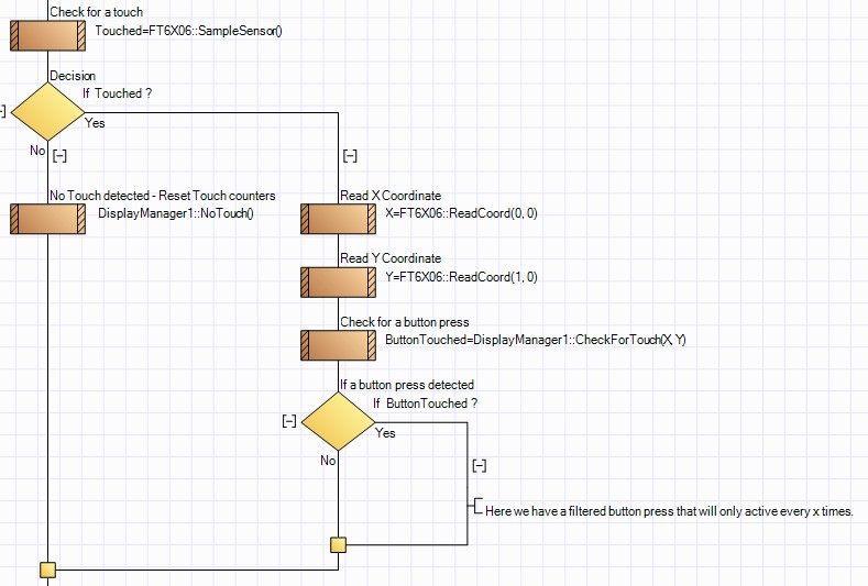
The Touch Repeat Rate property applies to button based widgets and sets the frequency that a valid touch will be detected for a held button. This is similar to holding down a single key on a keyboard and acts to reduce the frequency of positive button detections when touching the button. For example if you had a button that incremented a value, without the repeat rate the value would increment much faster then anticipated in an uncontrollable manner. When no touch is detected it is recommended to call the NoTouch macro to clear the touch counters and allow a more responsive user experience.
Example of implementing touch repeat rate

Examples
Basic Example
An example showing how to use the display manager with a gLCD and a touch interface to create a full HMI.
The example shows how to create a simple menu system as well as a toggle switch and a slider used to control a PWM output.
 Display Manager Demo
Keypad Example
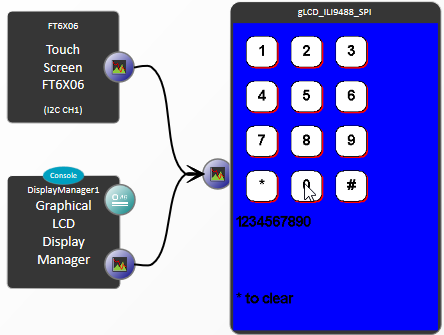
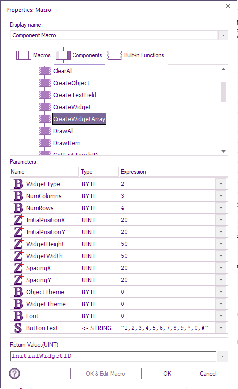
An example showing how you can use the CreateWigitArray component to create a touch keypad for your gLCD.

The CreateWidgetArray function macro has a number of parameters to allow high flexibility in what you can create:

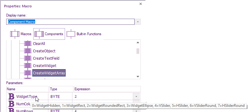
There are also tooltips for each parameter to help.

Note: if you get a unable to run simulation error then make sure you have the latest components downloaded.
How the key touch is detected
The first widget is automatically assigned a unique widget ID e.g. the first widget with text 1 on it is assigned 24.
All the following widgets ID is then incremented from 24, e.g. widget with text 6 on is assigned 24+ 5 = 29.
The widget button pressed can then be calculated from 29 – 24 + 1 = 6.
 Display Manager Widget Array Keypad Example
Macro reference
CheckForTouch

|
CheckForTouch
|
| Uses the X and Y coordinates from a touch sensor to check for Widget presses. Returns 0 for no Widgets pressed. Returns ID for a valid Widget press. Any touched slider Widgets will automatically move their thumb and value to the touch position.
|
 - UINT - UINT
|
X
|
|
|
 - UINT - UINT
|
Y
|
|
|
 - UINT - UINT
|
Return
|
ClearAll

|
ClearAll
|
| Removes all objects and Widgets from memory. Also clears the screen if required.
|
 - BOOL - BOOL
|
ClearScreen
|
| 0=Don't clear the screen, 1=Clear the screen
|
 - VOID - VOID
|
Return
|
CreateObject

|
CreateObject
|
| Define a none touchable graphical object. Returns the Object ID.
|
 - BYTE - BYTE
|
ObjectType
|
| 0=Hidden, 1=Rect, 2=Line, 3=Ellipse, 4=FilledEllipse, 5=FilledRect
|
 - UINT - UINT
|
X
|
| X Pixel Coordinate
|
 - UINT - UINT
|
Y
|
| Y Pixel Coordinate
|
 - UINT - UINT
|
Width
|
| Pixel Width or X Radius
|
 - UINT - UINT
|
Height
|
| Pixel Height or Y Radius
|
 - BYTE - BYTE
|
ObjectTheme
|
| Theme index to use to draw the object
|
 - BOOL - BOOL
|
DrawObject
|
| 0=Do not draw object yet, 1=Draw object now (Does not apply to hidden objects)
|
 - UINT - UINT
|
Return
|
CreateObjectArray

|
CreateObjectArray
|
| Creates a 2d array of objects that can be used to create things like tables. Returns the ID of the first object, the following objects have incremental IDs going column by column and then row by row.
|
 - BYTE - BYTE
|
ObjectType
|
| 0=Hidden, 1=Rect, 2=Line, 3=Ellipse, 4=FilledEllipse, 5=FilledRect
|
 - BYTE - BYTE
|
NumColumns
|
| Number of columns of buttons in the array
|
 - BYTE - BYTE
|
NumRows
|
| Number of rows of buttons in the array
|
 - UINT - UINT
|
InitialPositionX
|
| X location of the initial button
|
 - UINT - UINT
|
InitialPositionY
|
| Y location of the initial button
|
 - UINT - UINT
|
ObjectHeight
|
| Object height in pixels
|
 - UINT - UINT
|
ObjectWidth
|
| Object width in pixels
|
 - UINT - UINT
|
SpacingX
|
| Horizontal spacing between the widgets
|
 - UINT - UINT
|
SpacingY
|
| Vertical spacing between the widgets
|
 - BYTE - BYTE
|
ObjectTheme
|
| Object theme index to control the colour of the widgets text
|
 - BYTE - BYTE
|
Font
|
| Font used for the widgets text
|
 - STRING - STRING
|
ObjectText
|
| A comma seperated text field with the text for each object e.g. "1,2,3,.."
|
 - UINT - UINT
|
Return
|
CreateTextField

|
CreateTextField
|
| Creates a text field consisting of a rectangular border containing a single line of text
|
 - STRING - STRING
|
Text
|
| Text string to set as the label
|
 - UINT - UINT
|
X
|
| X Pixel Coordinate
|
 - UINT - UINT
|
Y
|
| Y Pixel Coordinate
|
 - UINT - UINT
|
Width
|
| Pixel Width
|
 - UINT - UINT
|
Height
|
| Pixel Height
|
 - BYTE - BYTE
|
Font
|
| GLCD Font Index to use
|
 - BYTE - BYTE
|
ObjectTheme
|
| Theme index to use to draw the object
|
 - BYTE - BYTE
|
HAlignment
|
| 0=Left, 1=Center, 2=Right
|
 - BYTE - BYTE
|
VAlignment
|
| 0=Top, 1=Middle, 2=Bottom
|
 - UINT - UINT
|
Return
|
CreateWidget

|
CreateWidget
|
| Define an interactive Widget or slider. Returns the Widget ID.
|
 - BYTE - BYTE
|
WidgetType
|
| 0=WidgetHidden, 1=WidgetRect, 2=WidgetRoundedRect, 3=WidgetEllipse, 4=VSlider, 5=HSlider, 6=VSliderRound, 7=HSliderRound
|
 - UINT - UINT
|
X
|
| X Pixel Coordinate
|
 - UINT - UINT
|
Y
|
| Y Pixel Coordinate
|
 - UINT - UINT
|
Width
|
| Pixel Width or X Radius
|
 - UINT - UINT
|
Height
|
| Pixel Height or Y Radius
|
 - BYTE - BYTE
|
WidgetTheme
|
| Theme index to use to draw the Widget
|
 - BOOL - BOOL
|
DrawWidget
|
| 0=Do not draw Widget yet, 1=Draw Widget now (Does not apply to hidden widgets)
|
 - UINT - UINT
|
Return
|
CreateWidgetArray

|
CreateWidgetArray
|
| Creates a 2d array of buttons that can be used to create things like keypads. Returns the ID of the first button, the following buttons have incremental IDs going column by column and then row by row.
|
 - BYTE - BYTE
|
WidgetType
|
| 0=WidgetHidden, 1=WidgetRect, 2=WidgetRoundedRect, 3=WidgetEllipse, 4=VSlider, 5=HSlider, 6=VSliderRound, 7=HSliderRound
|
 - BYTE - BYTE
|
NumColumns
|
| Number of columns of buttons in the array
|
 - BYTE - BYTE
|
NumRows
|
| Number of rows of buttons in the array
|
 - UINT - UINT
|
InitialPositionX
|
| X location of the initial button
|
 - UINT - UINT
|
InitialPositionY
|
| Y location of the initial button
|
 - UINT - UINT
|
WidgetHeight
|
| Widget height in pixels
|
 - UINT - UINT
|
WidgetWidth
|
| Widget width in pixels
|
 - UINT - UINT
|
SpacingX
|
| Horizontal spacing between the widgets
|
 - UINT - UINT
|
SpacingY
|
| Vertical spacing between the widgets
|
 - BYTE - BYTE
|
ObjectTheme
|
| Object theme index to control the colour of the widgets text
|
 - BYTE - BYTE
|
WidgetTheme
|
| Widget theme index to control the colour of the widgets
|
 - BYTE - BYTE
|
Font
|
| Font used for the widgets text
|
 - STRING - STRING
|
WidgetText
|
| A comma seperated text field with the text for each widget e.g. "1,2,3,.."
|
 - UINT - UINT
|
Return
|
DrawAll

|
DrawAll
|
| Redraws all of the defined Objects and Widgets. Doesn't draw text, this is done using the SetText macros.
|
 - VOID - VOID
|
Return
|
DrawItem

|
DrawItem
|
| Draws a single object or Widget onto the display without clearing the display. Doesn't draw text, this is done using the SetText macros.
|
 - UINT - UINT
|
ID
|
| Unique ID of the Object or Widget
|
 - VOID - VOID
|
Return
|
GetLastTouchID

|
GetLastTouchID
|
| Gets the ID of the last Widget that returned a valid press via the CheckForTouch macro. Returns 0 for no valid touch recorded.
|
 - INT - INT
|
Return
|
GetSliderValue

|
GetSliderValue
|
| Reads the value of one of the sliders ranging between 0 and 1.
|
 - UINT - UINT
|
WidgetID
|
|
|
 - FLOAT - FLOAT
|
Return
|
Initialise

|
Initialise
|
| Initialises the object and Widget control variables and sets up the default themes.
|
 - VOID - VOID
|
Return
|
ModifyPosition

|
ModifyPosition
|
| Moves an existing object or Widget to absolute coordinates on the screen.
|
 - UINT - UINT
|
ID
|
| Unique ID of the object or Widget
|
 - INT - INT
|
X
|
|
|
 - INT - INT
|
Y
|
|
|
 - BOOL - BOOL
|
Relative
|
| 0=Absolute Positioning, 1=Relative Positioning
|
 - VOID - VOID
|
Return
|
ModifyScale

|
ModifyScale
|
| Changes the width and height of the selected Object or Widget.
|
 - UINT - UINT
|
ID
|
| Unique ID of the object or Widget
|
 - UINT - UINT
|
Width
|
|
|
 - UINT - UINT
|
Height
|
|
|
 - VOID - VOID
|
Return
|
ModifyTheme

|
ModifyTheme
|
| Changes the theme index of the selected Object or Widget.
|
 - UINT - UINT
|
ID
|
| Unique ID of the object or Widget
|
 - BYTE - BYTE
|
Theme
|
| Theme index of the Widget or object
|
 - VOID - VOID
|
Return
|
NoTouch

|
NoTouch
|
| Called when no touch is present, Allows the repeat rate counter to be cleared allowing for better responses to fast touches.
|
 - VOID - VOID
|
Return
|
OverrideObjectTheme

|
OverrideObjectTheme
|
| Overrides the colour of an object theme, used by the draw object macro.
|
 - BYTE - BYTE
|
ThemeIndex
|
| Index of the object colour theme
|
 - BYTE - BYTE
|
FG_R
|
| Foreground colour channel value
|
 - BYTE - BYTE
|
FG_G
|
| Foreground colour channel value
|
 - BYTE - BYTE
|
FG_B
|
| Foreground colour channel value
|
 - BYTE - BYTE
|
BG_R
|
| Background colour channel value
|
 - BYTE - BYTE
|
BG_G
|
| Background colour channel value
|
 - BYTE - BYTE
|
BG_B
|
| Background colour channel value
|
 - VOID - VOID
|
Return
|
OverrideWidgetTheme

|
OverrideWidgetTheme
|
| Overrides the colour of a Widget theme, used by the draw Widget macro.
|
 - BYTE - BYTE
|
ThemeIndex
|
| Index of the object colour theme
|
 - BYTE - BYTE
|
FG_R
|
| Foreground colour channel value
|
 - BYTE - BYTE
|
FG_G
|
| Foreground colour channel value
|
 - BYTE - BYTE
|
FG_B
|
| Foreground colour channel value
|
 - BYTE - BYTE
|
BG_R
|
| Background colour channel value
|
 - BYTE - BYTE
|
BG_G
|
| Background colour channel value
|
 - BYTE - BYTE
|
BG_B
|
| Background colour channel value
|
 - BYTE - BYTE
|
HL_R
|
| Highlight colour channel value
|
 - BYTE - BYTE
|
HL_G
|
| Highlight colour channel value
|
 - BYTE - BYTE
|
HL_B
|
| Highlight colour channel value
|
 - BYTE - BYTE
|
LL_R
|
| Lowlight colour channel value
|
 - BYTE - BYTE
|
LL_G
|
| Lowlight colour channel value
|
 - BYTE - BYTE
|
LL_B
|
| Lowlight colour channel value
|
 - VOID - VOID
|
Return
|
SetSliderValue

|
SetSliderValue
|
| Sets the value of one of the sliders and optionally redraws the slider to reflect the value change.
|
 - UINT - UINT
|
WidgetID
|
|
|
 - FLOAT - FLOAT
|
Value
|
| Range: 0 to 1
|
 - BOOL - BOOL
|
RedrawSlider
|
| 0=Do not redraw, 1=Redraw
|
 - VOID - VOID
|
Return
|
SetTextFloat

|
SetTextFloat
|
| Draws a numerical value onto an object or Widget location. Useful for displaying, value statistics. Drawn using the object themes.
|
 - UINT - UINT
|
ID
|
| Unique identifier of object or Widget.
|
| [[File:]] -
|
Number
|
|
|
 - BYTE - BYTE
|
NumDP
|
| Number of decimal points to display
|
 - STRING - STRING
|
Unit
|
| Unit string to add after the numeric value. e.g. "g" or "s"
|
 - BYTE - BYTE
|
Font
|
|
|
 - BYTE - BYTE
|
HAlignment
|
| 0=Left, 1=Center, 2=Right
|
 - BYTE - BYTE
|
VAlignment
|
| 0=Top, 1=Middle, 2=Bottom
|
 - BYTE - BYTE
|
ObjectTheme
|
| Object theme index to control the colour of the text
|
 - BOOL - BOOL
|
Transparent
|
| 0=Background Colour Drawn, 1=Don't Draw Background Colour
|
 - VOID - VOID
|
Return
|
SetTextLabel

|
SetTextLabel
|
| Draws a single line of text onto an object or Widget location. Useful for labelling Widgets such as buttons or having name, value statistics. Drawn using the object themes.
|
 - UINT - UINT
|
ID
|
| Unique identifier of object or Widget.
|
 - STRING - STRING
|
Text
|
| Text string to set as the label
|
 - BYTE - BYTE
|
Font
|
| GLCD Font Index to use
|
 - BYTE - BYTE
|
HAlignment
|
| 0=Left, 1=Center, 2=Right
|
 - BYTE - BYTE
|
VAlignment
|
| 0=Top, 1=Middle, 2=Bottom
|
 - BYTE - BYTE
|
ObjectTheme
|
| Object theme index to control the colour of the text
|
 - BOOL - BOOL
|
Transparent
|
| 0=Background Colour Drawn, 1=Don't Draw Background Colour
|
 - VOID - VOID
|
Return
|
SetTextNumber

|
SetTextNumber
|
| Draws a numerical value onto an object or Widget location. Useful for displaying, value statistics. Drawn using the object themes.
|
 - UINT - UINT
|
ID
|
| Unique identifier of object or Widget.
|
| [[File:]] -
|
Number
|
|
|
 - STRING - STRING
|
Unit
|
| Unit string to add after the numeric value. e.g. "g" or "s"
|
 - BYTE - BYTE
|
Font
|
|
|
 - BYTE - BYTE
|
HAlignment
|
| 0=Left, 1=Center, 2=Right
|
 - BYTE - BYTE
|
VAlignment
|
| 0=Top, 1=Middle, 2=Bottom
|
 - BYTE - BYTE
|
ObjectTheme
|
| Object theme index to control the colour of the text
|
 - BOOL - BOOL
|
Transparent
|
| 0=Background Colour Drawn, 1=Don't Draw Background Colour
|
 - VOID - VOID
|
Return
|
Property reference

|
Properties
|

|
Graphical Display
|
| Graphical Display to draw our objects on
|

|
DM Library
|
| Display Manager compatible GLCD library component. e.g. Bitmap drawer components.
|

|
Ram Usage Bytes
|
| The calculated number of bytes of RAM required by the display manager.
|

|
Text Align Offset
|
| Number of pixels to move away from an edge when calling
|

|
Objects
|

|
Max Objects
|
| The total number of primitive objects allowed on the screen at once. Sets the size of the RAM buffers used to track the various screen elements. Each object requires 10 bytes of RAM to stores things like size, location and type.
|

|
Object Theme Count
|
| Sets the number of themes available when drawing primitive objects. Each object theme requires 6 bytes of RAM to store the colour channels.
|

|
Object & Text Theme 0
|

|
Foreground
|
| Foreground colour of the theme
|

|
Background
|
| Background colour of the theme
|

|
Object & Text Theme 1
|

|
Foreground
|
| Foreground colour of the theme
|

|
Background
|
| Background colour of the theme
|

|
Widgets
|

|
Max Widgets
|
| The total number of touchable interactibe objects allowed on the screen at once e.g. Widgets and sliders. Sets the size of the RAM buffers used to track the various screen elements Each Widget requires 18 bytes of RAM to stores things like size, location, value and type.
|

|
Touch Repeat Rate
|
| Sets the period for touch repeats in terms of calls of the CheckForTouch macro. Widgets will only register a repeat touch after x calls if continually held down. Sliders will always register a touch. The touch count can be cleared using the NoTouch macro if no touch is detected.
|

|
Slider Thumb Width
|
| Number of pixels wide to make a slider thumb marker,
|

|
Slider Center Line Thickness
|
| Number of pixels thick to draw the slider central line
|

|
Widget Theme Count
|
| Sets the number of themes available for drawng Widgets. Each Widget theme requires 12 bytes of RAM to store the colour channels.
|

|
Widget Theme 0
|

|
Foreground
|
| Foreground colour of the theme
|

|
Background
|
| Background colour of the theme
|

|
Highlight
|
| Highlight colour of the theme
|

|
Lowlight
|
| Lowlight colour of the theme
|

|
Widget Theme 1
|

|
Foreground
|
| Foreground colour of the theme
|

|
Background
|
| Background colour of the theme
|

|
Highlight
|
| Highlight colour of the theme
|

|
Lowlight
|
| Lowlight colour of the theme
|
Component Source Code
Please click here to download the component source project: FC_Comp_Source_Lib_DisplayManager.fcfx
Please click here to view the component source code (Beta): FC_Comp_Source_Lib_DisplayManager.fcfx
![]() Display Manager Widget Array Keypad Example
Display Manager Widget Array Keypad Example
