Web Developer Getting Started Guide
Note: The earliest version Web Developer will run on is Flowcode 10.1
Contents
Introduction
Web Developer allows the development of interactive web pages using the Flowcode IDE environment. Special web components can be added to a 2D panel to create a visual representation of the webpage and interactive functionality can be added using flowcharts.
Its introduction means that Flowcode users can now use a Flowocde to create programs that run on a wide range of devices, for example:
- Mobile phones and tablets
- PCs: Windows, Apple, and Linux
- Embedded devices that support a browser
Getting started
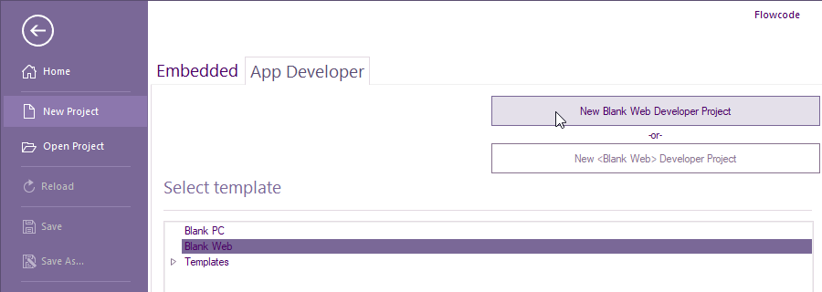
To start web developer, run Flowcode and select NEW PROJECT
Select App Developer tab then select Blank Web then New Blank Web Developer Project
Select File, Save As... and name your project e.g. MyFirstWDProject.
I would recommend not to have any spaces or use underscore for spaces within the project name and directory path.
The project file extension will be .fcsx
Creating a basic webpage containing a shape and text with no interaction
Unlike Embedded or PC Developer components are only wihtin These 4 sections:
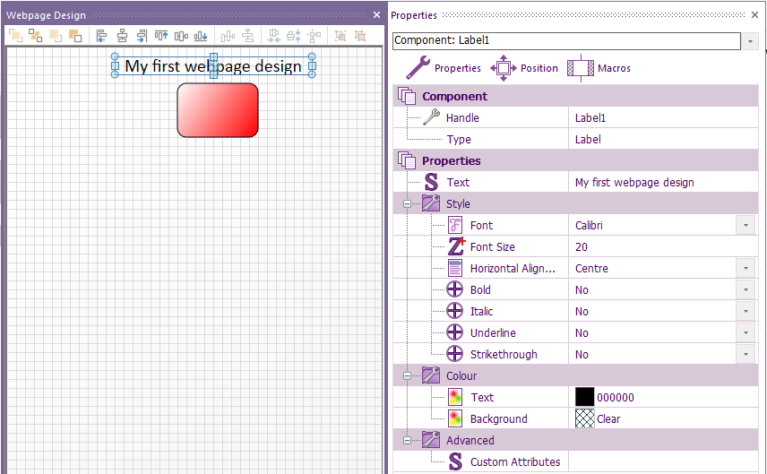
Within Component Libraries > Creation, add a Shape and Label to the 2D panel > Webpage Design.
If you can't see the 2D Web design panel, select View > Webpage Design
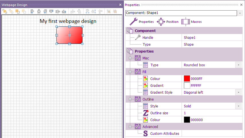
Change the shape via its properties to any shape and colour and change the text to any size and colour:
To create the webpage, select Build > Create web page...
A pop-up with briefly show the path of the created webpage:
A HTML file will be generated within the same folder as your project file:
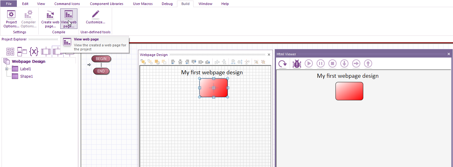
You can either load the html file in your preferred device e.g. tablet, mobile, PC etc or if you want to wait until your project has finished you have the option of viewing and interacting with the webpage within Flowcode's 'Html Viewer.
To do the latter, after the webpage has been created, select Build > View web page...
If you make any changes, select Build > Create web page... before you select Build > View web page...
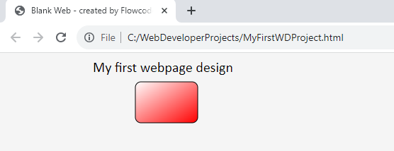
If you run the html file within a browser, e.g. Chrome, you will see they are identical:
Action on a button press
On a press of a button, we will be setting text to display how many times button has been clicked and adding an indicator to toggle state on each button press.
Start by creating a new Web Developer project for example ActionOnButtonPress.
Add a Button from Component Libraries > Inputs
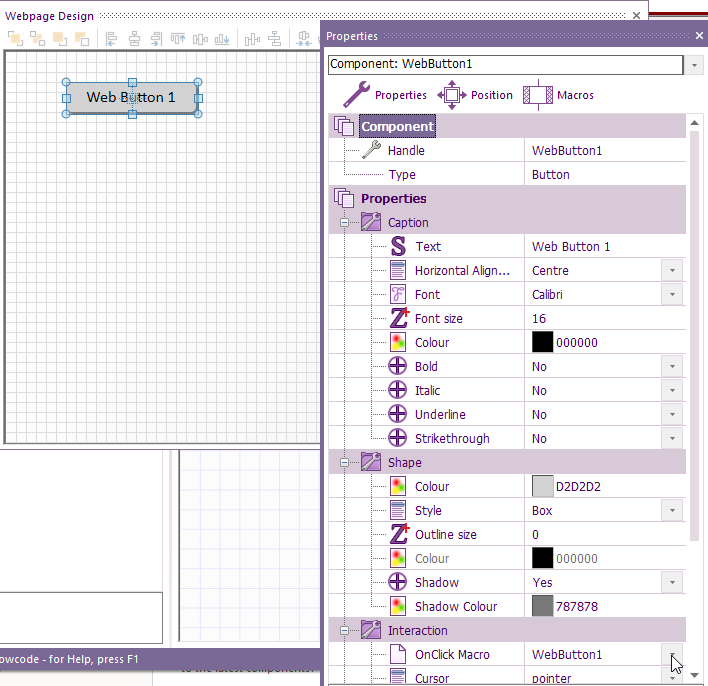
Change the properties e.g. Handle (for the button reference), shape, text, colour etc.
Also, within Properties, under Interaction, select the dropdown arrow beside OnClick Macro and select <Add new>.
A Create a New Macro window will pop-up Just change the name to the button reference e.g. WebButton1, select OK
This will automatically create a new event macro called WebButton1
Now add a Label from Component Libraries > Creation and add an Indicator from Component Libraries > Outputs to the Webpage Design panel.
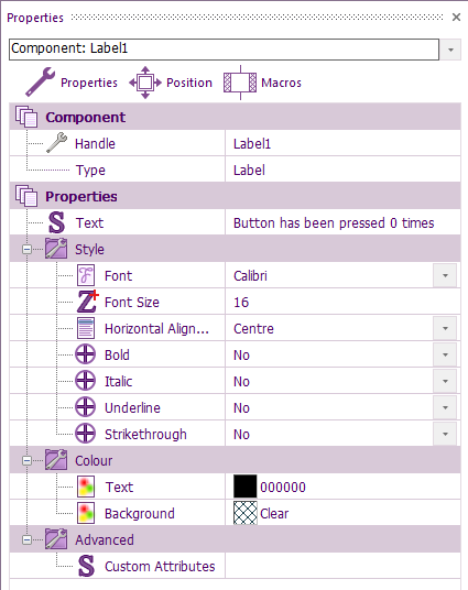
For the label properties change the font to Calibri, Font Size to 16.
So we can align all the components up, and get a good idea of what it will look like, change the Text to Button has been pressed 0 times
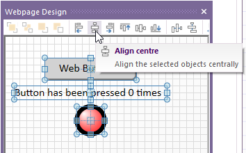
There are various icons that can be clicked to make the layout neater, e.g. swipe over the components you what to align then click Align centre.
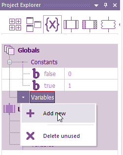
We will be adding three global variables from the {X} of the Project Explorer.
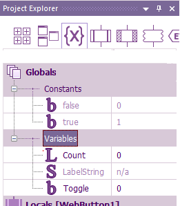
The variables are: Boolean called Toggle with an initial value of 0 and an Integer called Count, also with an initial value of 0 and a String called LabelString which can be left to the default length of 200
If added correctly you should see:
Within the user macro that has just been created e.g. WebButton1, place the component function macros or command icons e.g calculation boxes, decision icon etc.
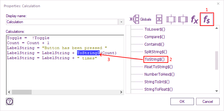
Place a calculation icon with the following:
Toggle = !Toggle
Count = Count + 1
LabelString = "Button has been pressed "
LabelString = LabelString + ToString$(Count)
LabelString = LabelString + " times"
The ToString$ function is found within the calculation functions (f$):
It's function is to convert any integer to a string so it can be used to display within Labels or Text Block components
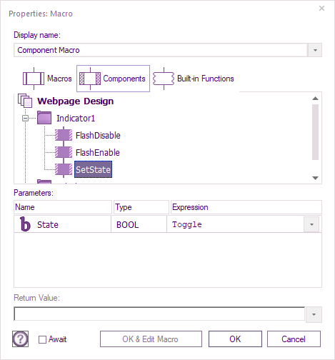
Select Components from within Project Explorer, then for Indicicator1, drag SetState to the WebButton1 user macro.
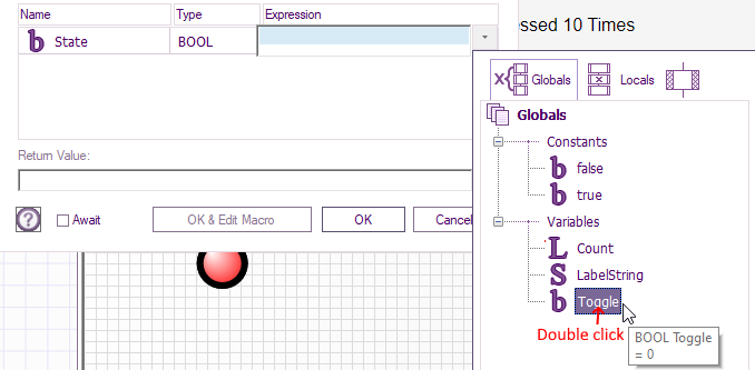
Within the macro that pops up after dragging enter Toggle just under Expression:
Instead of typing toggle you can selectt the dropdown arrow just under expression and drag the variable to the expression box:
Drag Label SetText to the WebButton1 user macro and enter (or drag) the string variable.
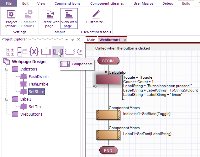
Your WebButton1 user macro should now look like this:
The red star is where that Icon or component has been added but not yet saved, so make sure you save the project.
It's important to note that unlike Embedded and App Developer, the only code required in main is to initially set a state, value or text etc.
There is no continuous loop.
Think of everything in the Web Developer the equivalent of interrupt macro driven only.
For example, on a click of a button or switch change or on receiving data.
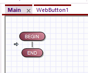
For the project to successfully work this is Main:
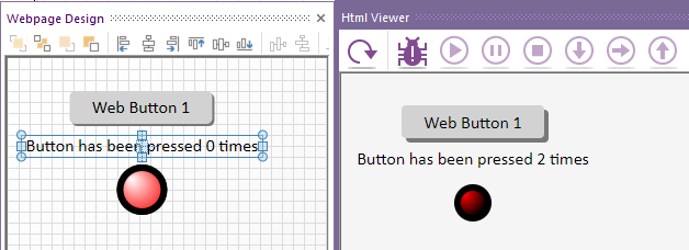
After Build > Create web page, then Build > View web page the Html viewer is working as intended:
The html file is now ready for loading on a browser for your choice of devices.
Chart Logging a slider value every second
The idea is to have two timers running one every 100ms to retrieve the slider value as you can't have infinite loops within main or any other event or user call macros. The other timer is for every second which is for chart logging only.
Add the following components from Component Libraries:
Text Block x1 from Creation, from within properties, change text to Slider Value is:
Line Chart x1 from Charts, from within properties, change the following:
Chart > Title to Slider Logging
X-axis > Name to Time (Seconds)
Y-axis > Name to Value, Auto-scale to Yes, Start to 0 & End to 100
Series > Series Count to 1
Slider x1 and Radio Button x3 from Controls
Timer x2 from Helper
You will need to add meaningful event macro names for each timer like you did for the switch.
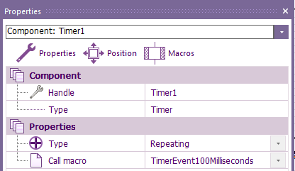
For Timer1 name it TimerEvent100Milliseconds
and for Timer2 name it TimerEvent100Milliseconds
Both timers require Type to be Repeating.
Slider x1 and Radio Button x3 from Controls
The slider can be left at the 0 to 100 Scale settings.
The other visual properties can be adjusted to suit your requirements.
Radio1 is the only button to have Checked within properties set to Yes, other tow buttons are set to No The 'Text is Logging Off 'OnClick Macro is LoggingOff
Radio2 The 'Text is Logging On 'OnClick Macro is LoggingOn
Radio3 The 'Text is Chart Reset 'OnClick Macro is ChartReset
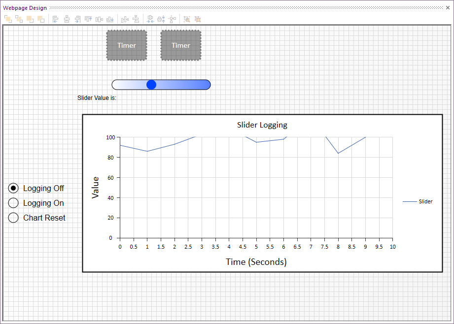
Arrange all the components on the 2D Webpage Design Panel.
For example, this is what mine looks like:
Tip: Any Component that is grey, rectangular with a perforated edge will be invisible when running html webpage directly or the Build > View Web page... html simulator
We need to add some global variables, so they can be available within all the event macros.
From Project Explorer' > Variables , select the upper Variables > Add new as they are global and add the following integers:
CountSeconds, SliderValue
Add the following Boolean:
LoggingEnabled
There is one Local variable to add and that is only required for the TimerEvent100Milliseconds event macro
Select that macro from the Project Explorer > Macros or from the top of the flowcharts
Select Project Explorer > Variables and this time Select the Variables drop-down under Locals and add the following String variable:
StringVar
The Array Length can be left blank
Now to drag the component macros and command icons (Calculation, Delay etc) into the Event macros and Main.
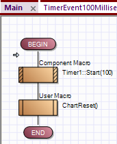
Main From Project Explorer > Components
Drag Timer1 Start and enter a value of '100 For the Expression
That will mean the Timer1 component will call the TimerEvent100Milliseconds event macro every 100ms.
From Project Explorer > Macros
Drag ChartReset event macro:
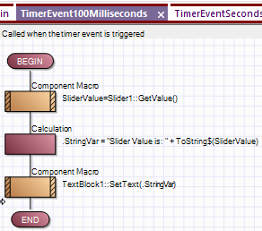
TimerEvent100Milliseconds
From Project Explorer > Components
Drag Slider1 > GetValue
For the Return Value:(INT)
Select the Down arrow, select SliderValue from the global variables > OK
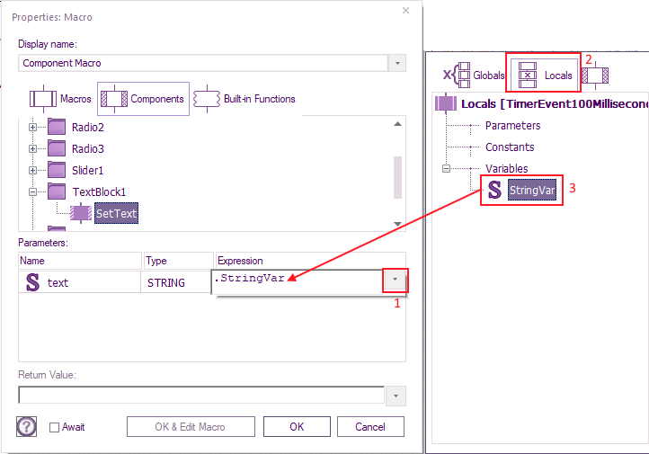
Drag TextBlock1 > SetValue to below the SliderValue component macro and for the return value select Locals > StringVar
From Project Explorer > Icons
Drag a Calculation Icon in between the two components and enter:
.StringVar = "Slider Value is: " + ToString$(SliderValue)
Hint: the ToString$ is mentioned in the previous section.
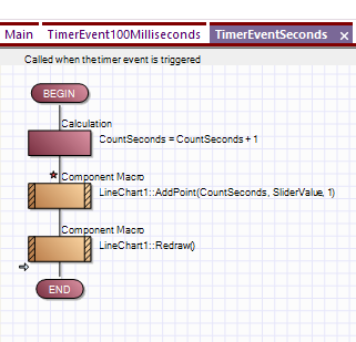
TimerEventSeconds
From Project Explorer > Icons
Drag a Calculation Icon and enter:
CountSeconds = CountSeconds + 1
From Project Explorer > Components
Drag LineChart1 > AddPoint below the calculation icon and enter:
CountSeconds for x
SliderValue for y
1 for  index
Drag LineChart1 > Redraw below the AddPoint.
There are no expressions or return values to enter.
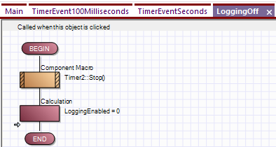
LoggingOff
From Project Explorer > Components
Drag Timer2 > Stop
From Project Explorer > Icons
Drag a Calculation Icon below the Timer2 Stop and enter:
LoggingEnabled = 0
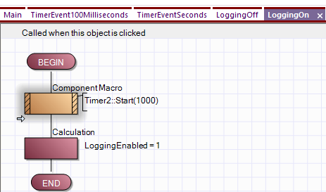
LoggingON
From Project Explorer > Components
Drag Timer2 > Start and enter 1000 for Timer iInterval
From Project Explorer > Icons
Drag a Calculation Icon below the Timer1 Start and enter
LoggingEnabled = 1
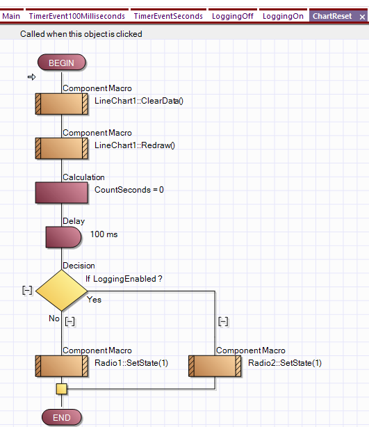
ChartRest
For the final event macro add in the following order from top to bottom:
From Project Explorer > Components
Drag LineChart1' > ClearData
Drag LineChart1' > Redraw
From Project Explorer' > Icons
Drag a Calculation and enter
CountSeconds = 0
Drag a Delay ' and enter 100 , leaving the default milliseconds selected.
Drag a Decision icon and enter for If:
LoggingEnabled
For the Yes branch, From Project Explorer > Components
Drag Radio2 > SetState and for bState enter
1
For the No branch
Drag Radio1 > SetState and for bState enter
1
The example is now complete.
As for the other examples, select Build > Create web page... before you can either use the generated html file or built-in html viewer.
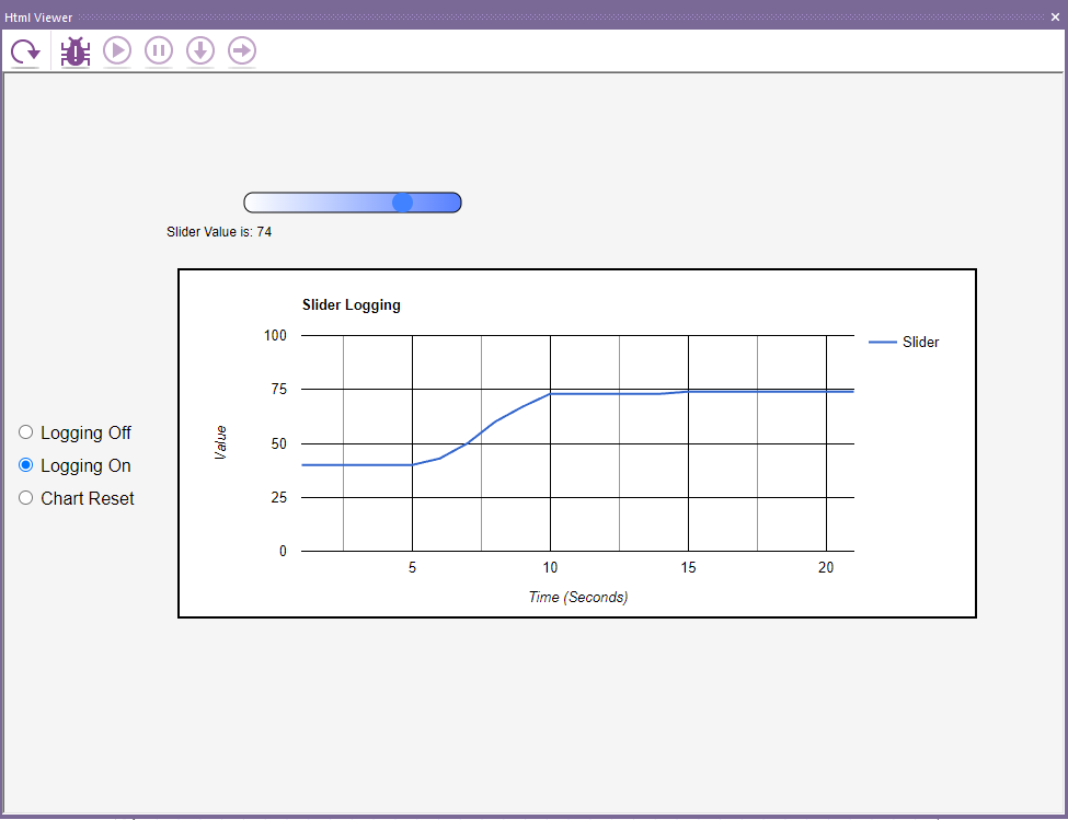
This is the example in action with the slider being moved via the built-in html viewer:
Retrieve data from an API URL
From now, as it's getting more complicated, there will be an example project files you can download just in case you make any mistakes.
There is a public free fake API for testing site we will use - Fake API website
If you look at website, you will see tags within double quotes, e.g. "id" there will also be a reference after e.g. :1
You will also see "title": "sunt" etc.
Another tag is "Body" and you can see it starts with "quia, this is the data we ae capturing.
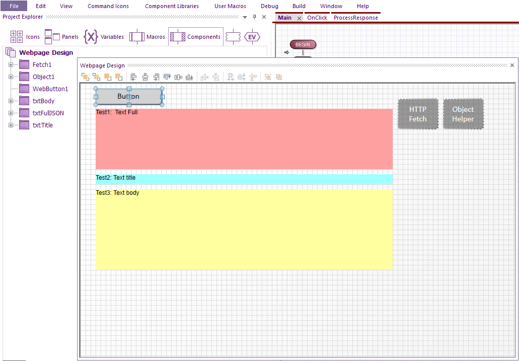
To capture characters from a website, add HTTP Fetch and Object Helper from Component Libraries > Helper
Add Button and three Input text from Controls.
From within component properties, you can change the background colour, add initial text, and rename the input text from the Handle.
This is how the components are laid out on the 2D Panel
You will notice there are two event macros, they are automatically added when the name is entered within properties.
This was explained from within Action on a button press
With the button next to Onclick Macro you can use the default name of OnClick.
For Http Fetch you can use the default name of ProcessResponse.
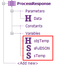
Note a Parameter called Data will automatically be added.
The H just means it's an object/Handle
Now we add the required components within the event macros in the required order to retrieve data from the test webpage.
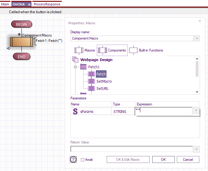
First dealing with the button.
This is nice and easy as all we are adding is a Fetch component with the Fetch function.
Within the Parameters enter two sets of quotation marks:
""
Add the following local varables outlined in red:
The String ![]() can be left as the default i.e. leave the Array Length blank.
can be left as the default i.e. leave the Array Length blank.
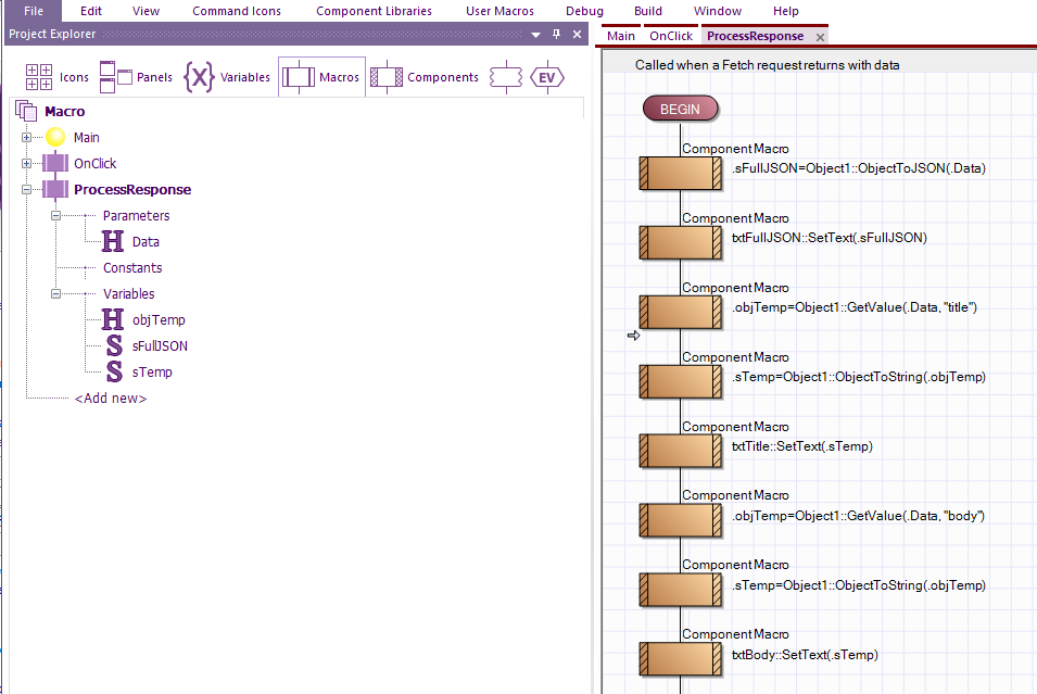
Now add the following component function macros:
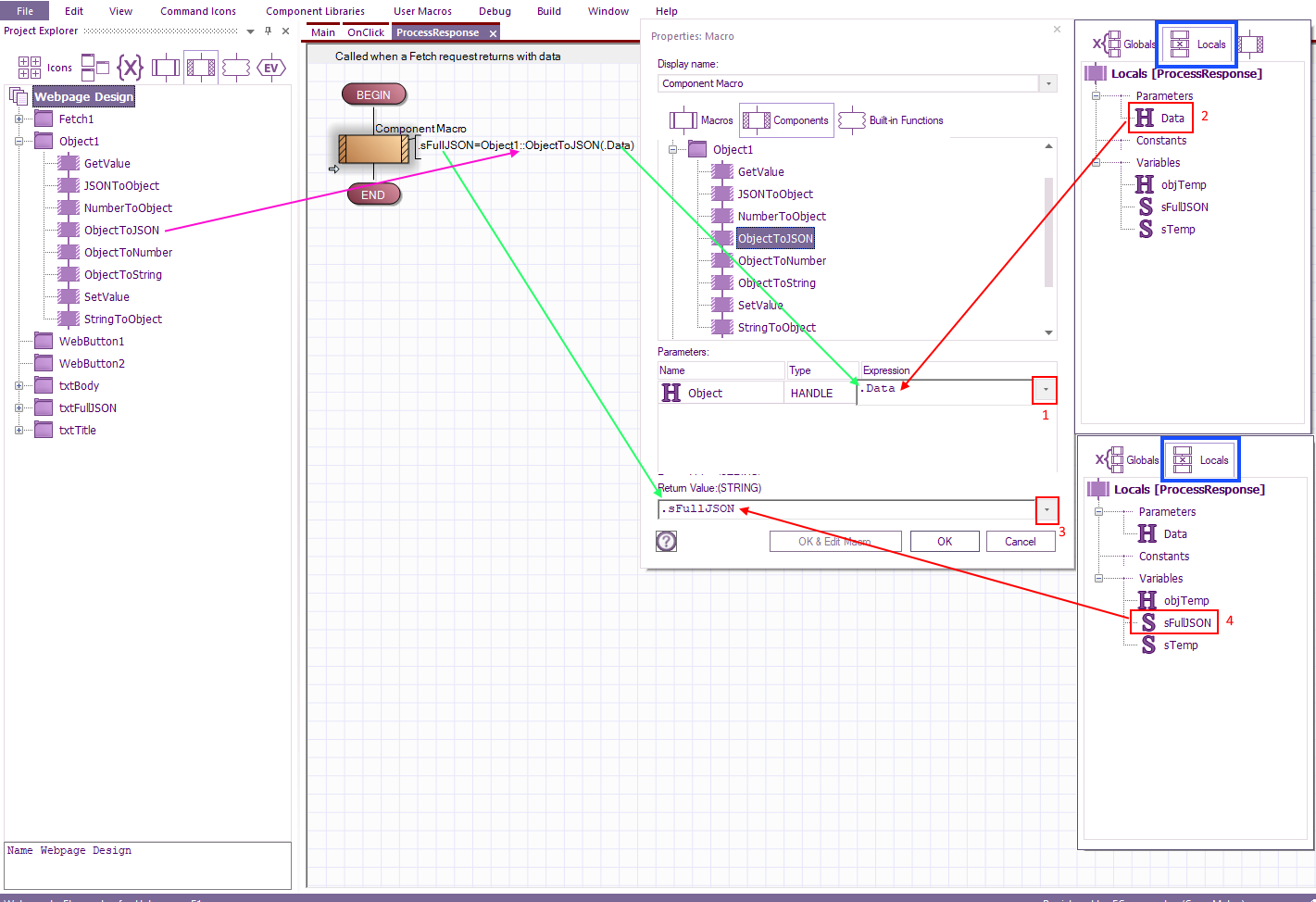
Hint. When a component macro has a return value (output) and a parameter (input) then the format is 'ReturnValue=Component:Function(Parameter)
For example, with the first component icon
The purple arrow is the component function.
The green arrow shows where the variables are located.
The red arrows show where to drag the variables from.
To check you have dragged all the correct components the finished example is below
After Build > Create web page... the html file will be gererated.
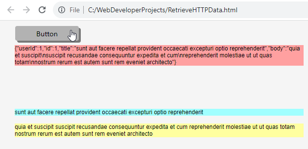
You can either view the result of pressing the button via that or via Build > View web page...
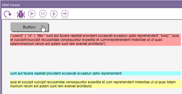
This is what you should see via chrime explorer:
Via Build > View web page...
Two way communication
This final part of the tutorial will enable you to have simplest two-way communication between your web browser and embedded device.
Links
Web Developer examples that use a temperature sensor connected to an ESP32.
Examples using the fetch component
Web Developer
PC Developer
App Developer
JSON Decoder example
JSON Encoder example
Array Helper example
Timer example
