Dashboard Panel
From Flowcode V10 The Dashboard panel is now the Legacy Panel and it is only used for projects created with versions between Flowcode V6 and Flowcode V9 only.
2D components on the Dashboard panel can be moved to the new panel by right-clicking on the component and selecting Move to option
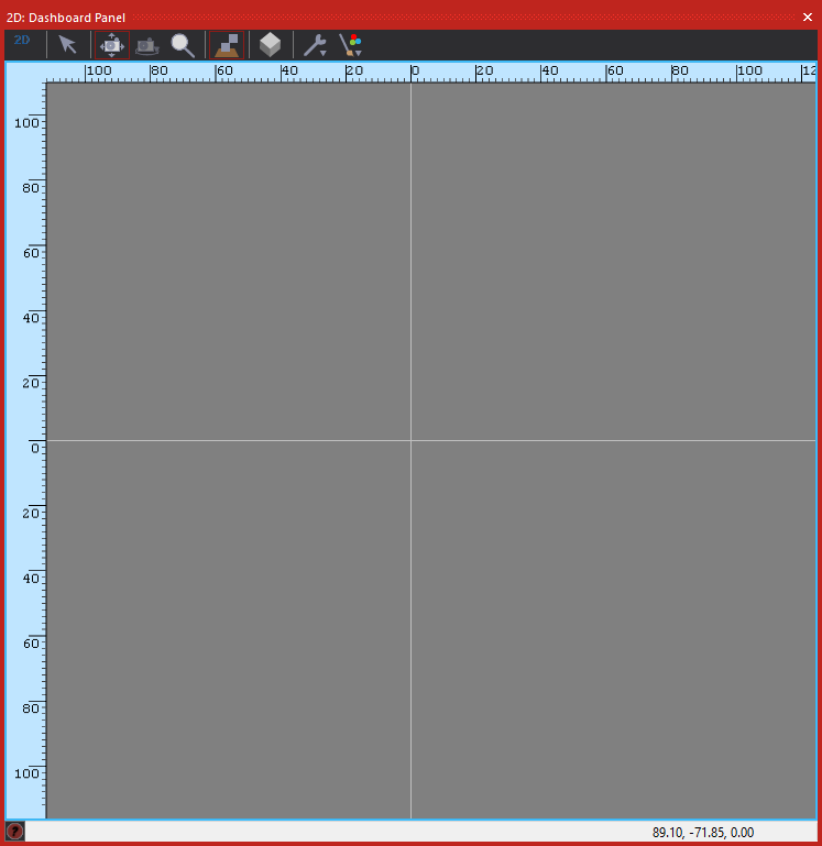
The Dashboard Panel provides a framework on which to load Flowcode components that compliments the System Panel. It is designed to show the representation of abstract components such as dials and meters during simulation.
Contents
Overview
The Dashboard Panel is opened by selecting it in the View menu. Unlike the System Panel, the Dashboard panel gives only a top-down view of the components. Components are typically designed in the System Panel and then used during programming in the dashboard.
When the dashboard opens, you see a colored workspace. The color is set in the 'General Options'. ![]()
Dashboard or System Panel?
To find out more about the differences between the Dashboard and System panel and also recommendations on how to use the two panels for different types of projects please see the article Choosing your Simulation Panel
Differences to the System panel
The Dashboard panel has a Controls toolbar running horizontally across the top. However, these have more limited functionality on the System Panel as the Dashboard is not designed for modelling objects or creating components.
Components can be added to the Dashboard panel from the Components Toolbar as they can to the System Panel. The intent is that this is used for more abstract and non-physical components such as dials and meters, though there is no restriction on what you can add.
These components can then easily remain visible while the camera and any moving objects simulate on the System panel.
The camera on the Dashboard is fixed, unlike the System panel which has full 3D movement.
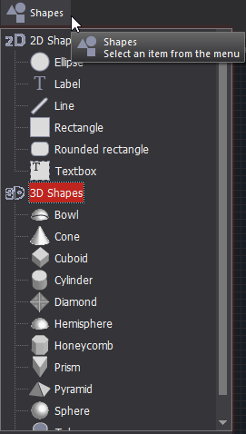
Users can bring either 2D or 3D shapes onto the Dashboard Panel to create items such as control panels etc. This is done by adding a shape from the top components menu, just as you would a regular component.
Camera control
The Dashboard camera can only pan, it will not rotate. This means the Dashboard always displays a top-down 2D appearance, though in reality it is capable of displaying any 3D object.
See the section Camera Control for more details on manipulating the camera and selecting objects.
Selecting items
Multiple items can be selected:
- By holding down the Shift key and then clicking on a number of items, one after the other;
- By left-clicking the mouse button and dragging over the items.
They can then be grouped:
- By clicking on the 'Group' icon.

- By selecting the 'Group' option from the ‘Selection’ menu which appears when you click the right-hand mouse button.
In this way, complex nested structures can be assembled from a number of parts. To ungroup, select the object and then click on the same icon.

